
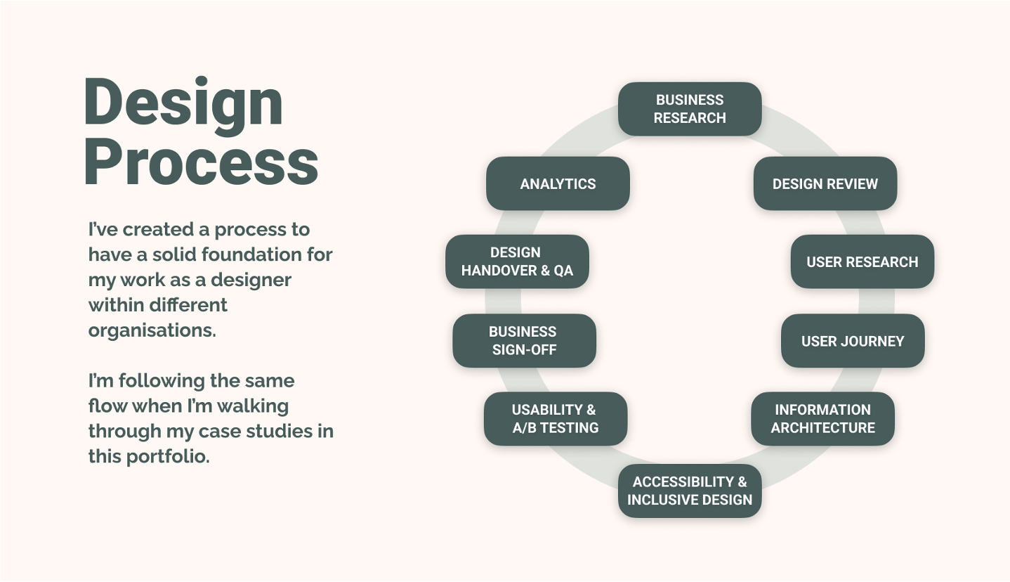
I want to understand the average user’s profile based on the current customer base, and prove my & business hypotheses.
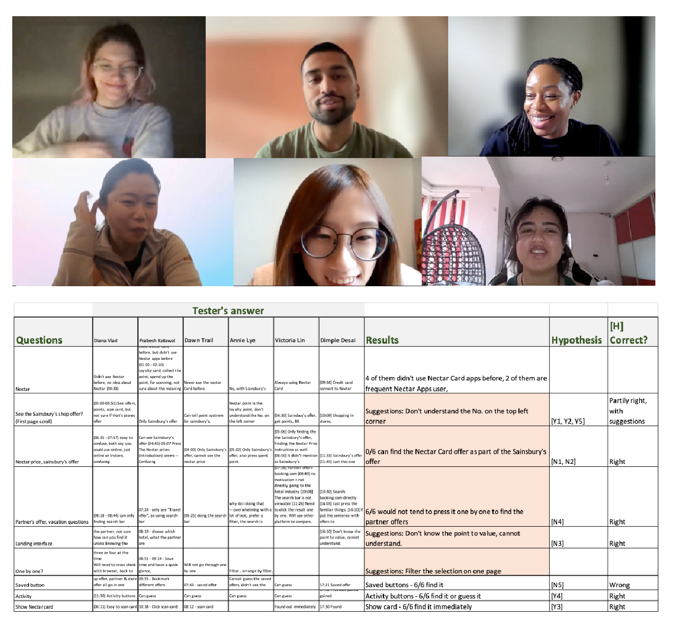
I only mention those results that lead to UI changes.
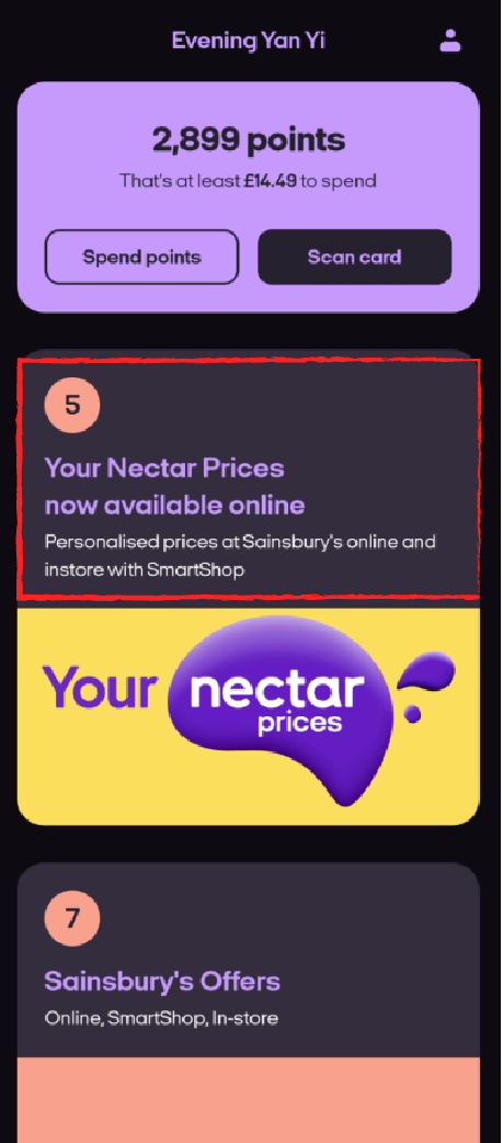
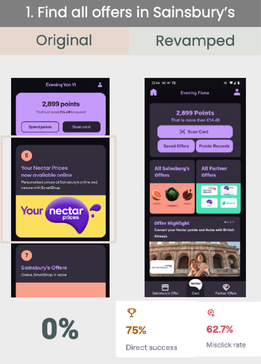
0/6 = 0%
can find the Nectar Card prices as part of Sainsbury’s offer, even though that’s on the top of the page.
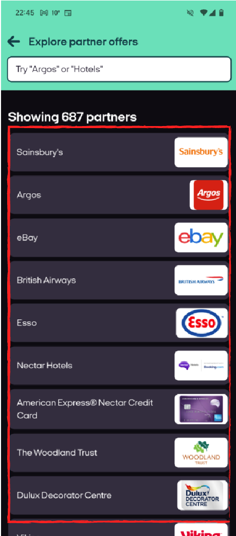
6/6 =100%
Would not press the partners one by one to see the partner’s offering from Nectar.
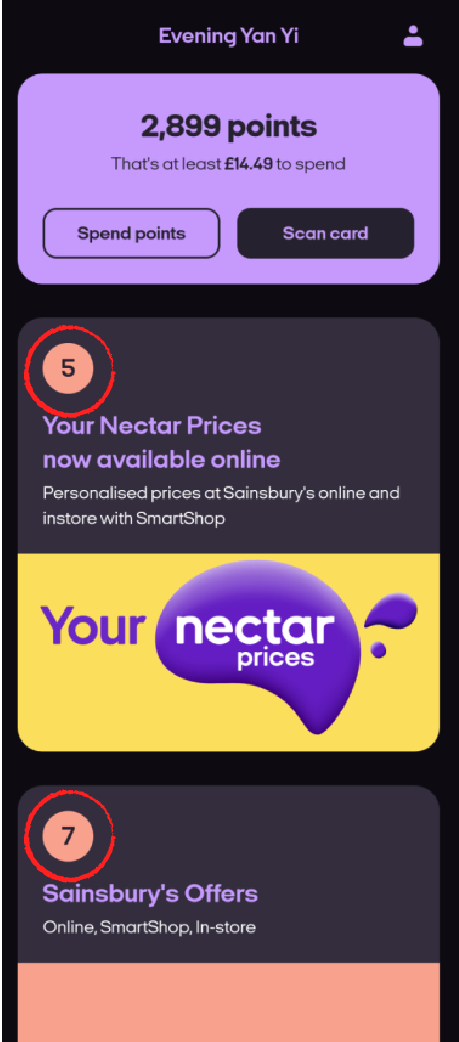
Suggestions 1
Clarify the No. on the top left corner
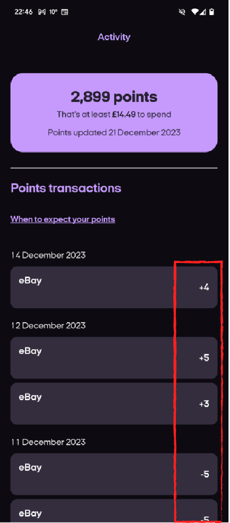
Suggestions 2
Clarify how's the Nectar point coming from
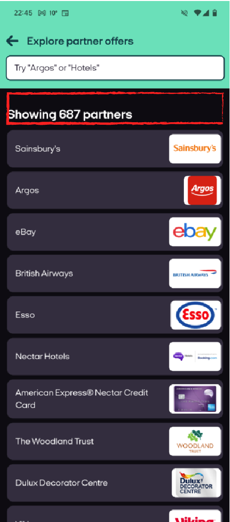
Suggestions 3
Provide filters on the partner’s offer page
Reconsider the information architecture.
- I found there is too much information on the homepage so some of the information cannot be found.
- The navigation bar can be utilized as shortcuts & categorization.
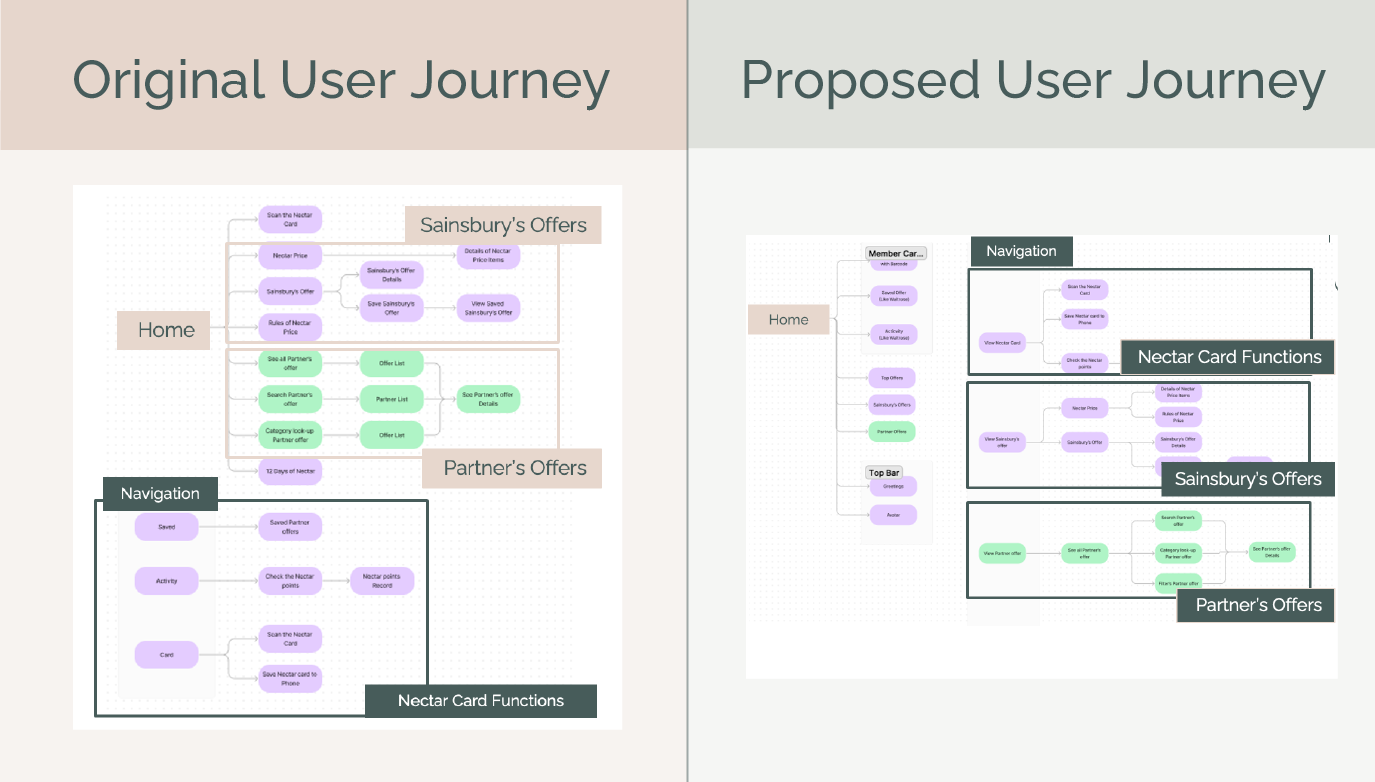
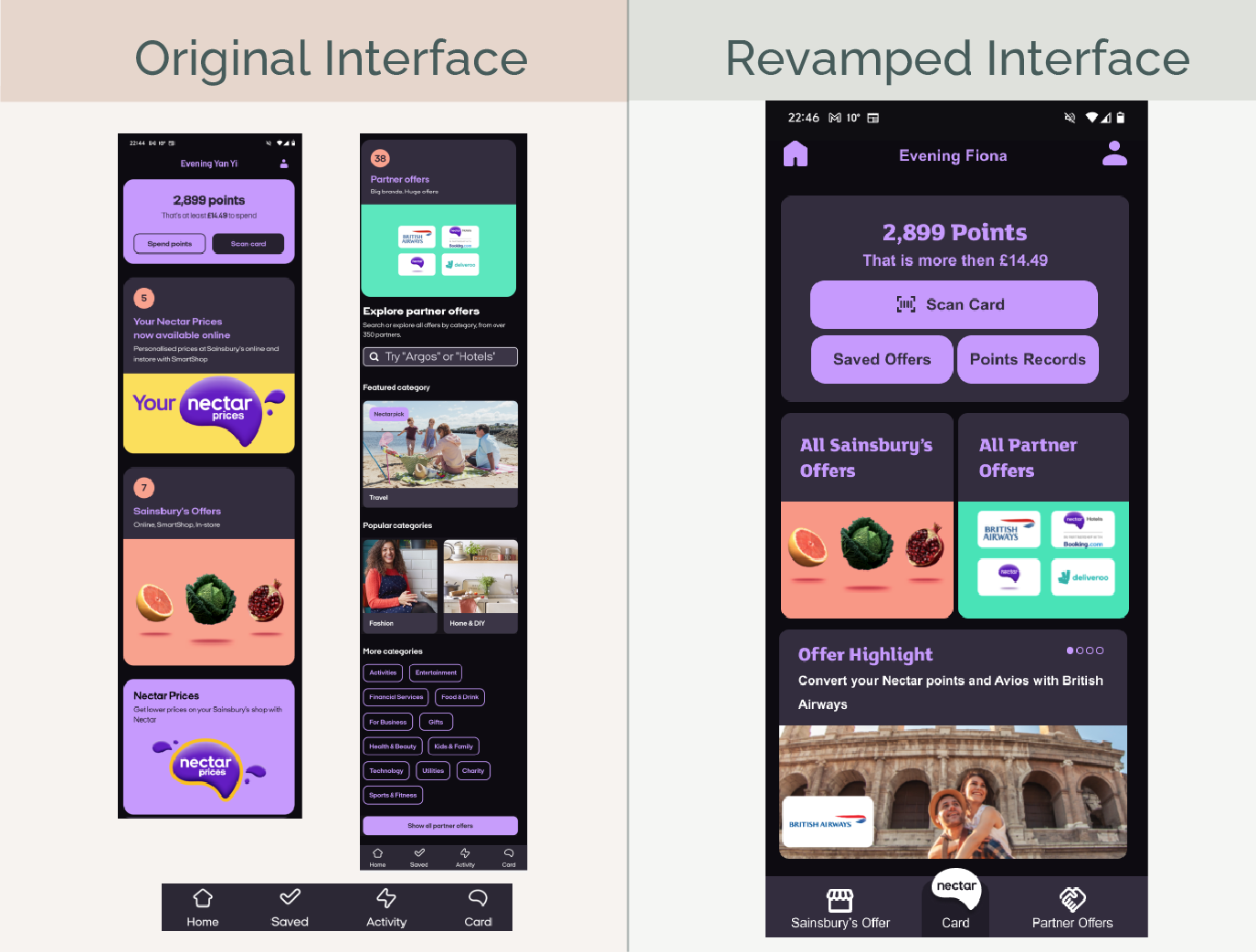
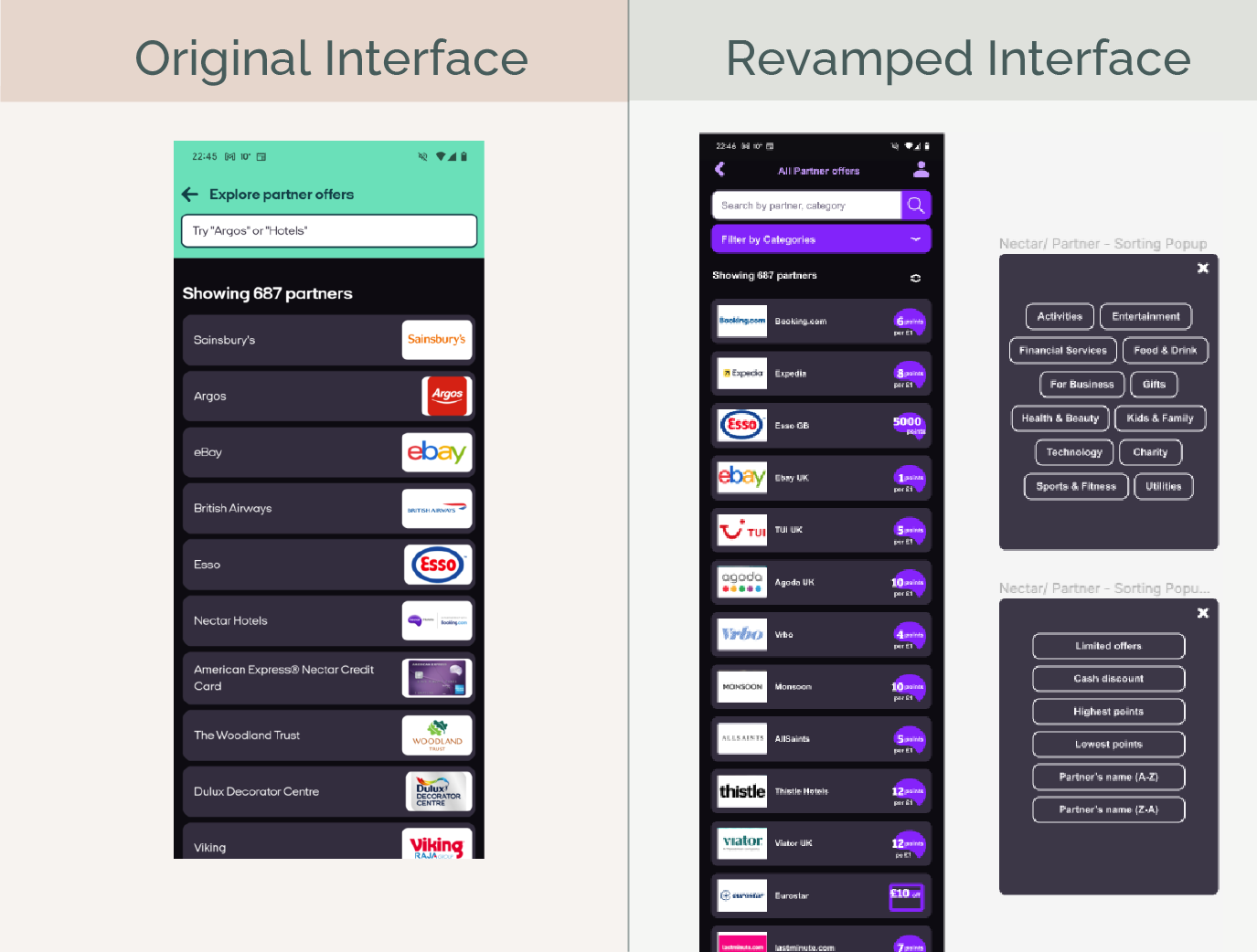
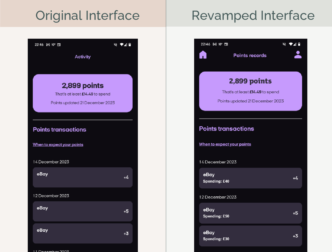
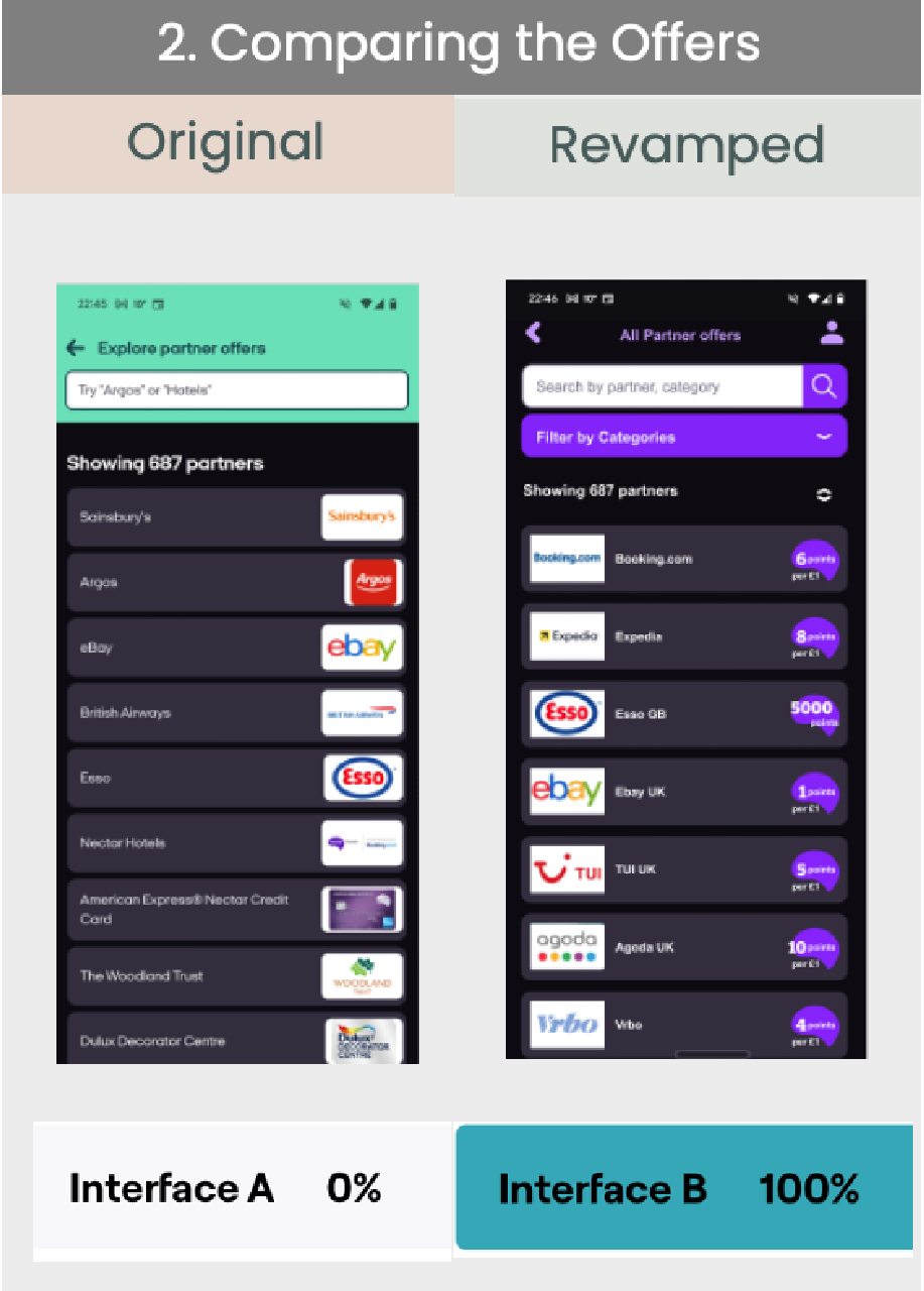
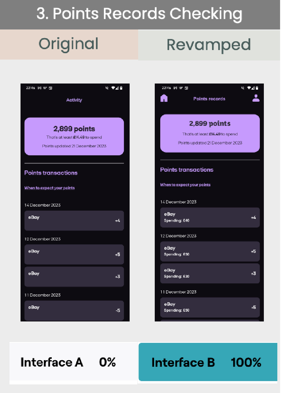
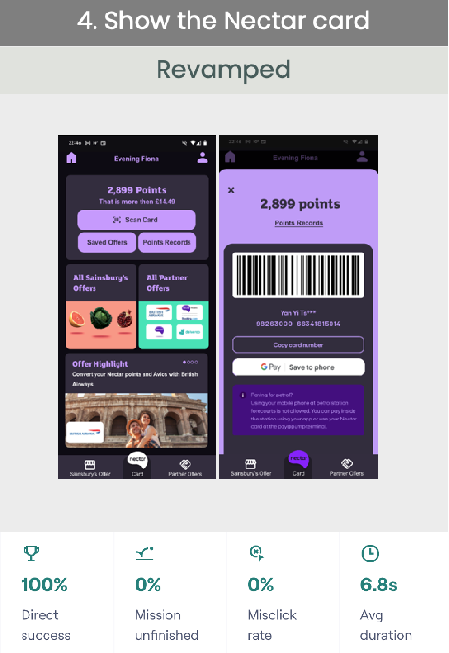
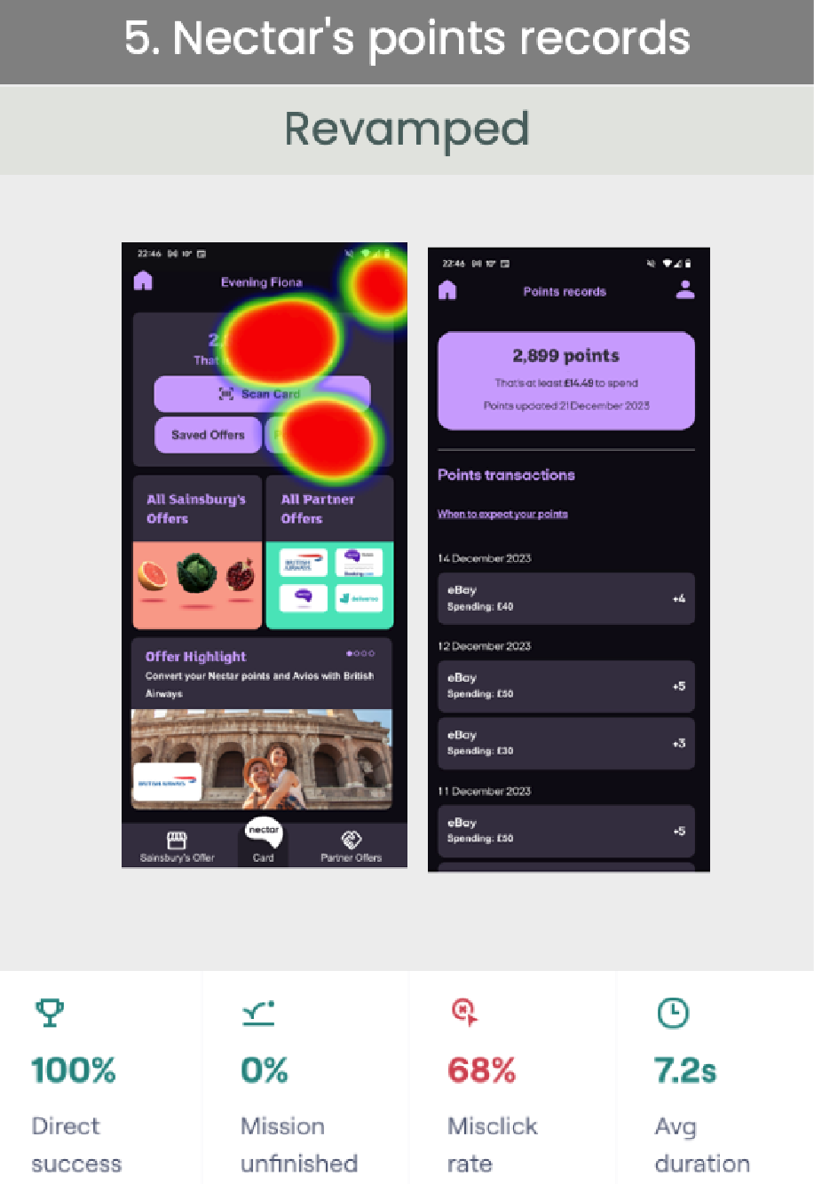
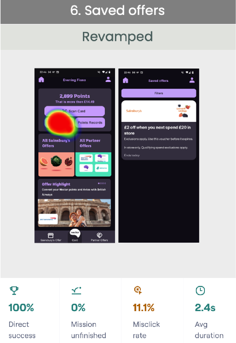
Make sure three functions are easily accessible:

In preference test No.1. Although there was a 75% success rate. However, while I see the line record, all of the misclick rates are coming from the same tester. I might need more testers to confirm my interpretation of this result.
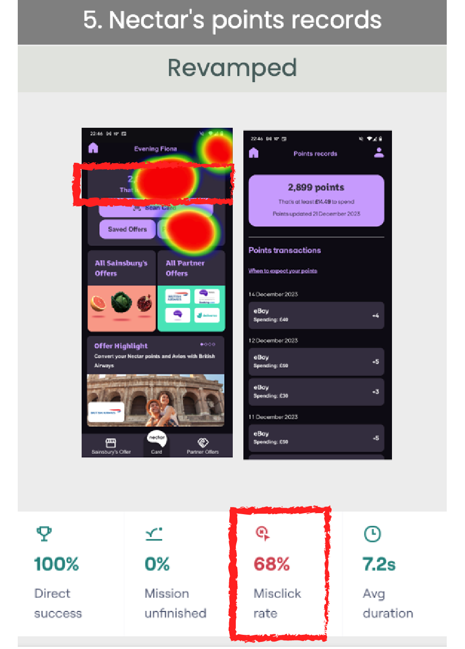
In preference test No.5, I found there was a high misclick rate. From the heatmap, I can see plenty of testers trying to click on the total points directly. I will try to add a direct link to points records on the total points records.
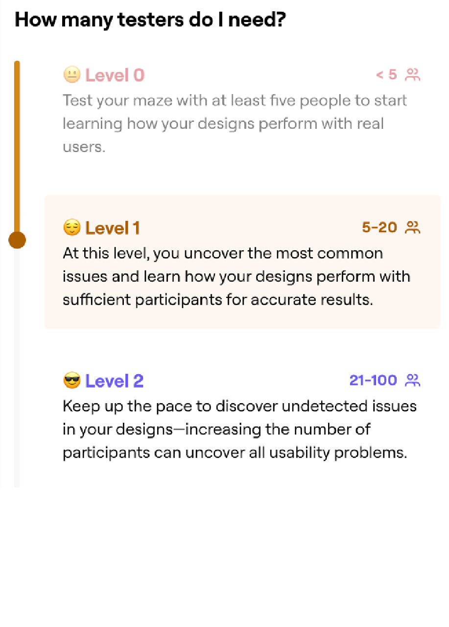
This is one of the personal project cases of the seven-month UX Design Bootcamp. For my preference test, I just covered it with eight testers. If my tester no. reach 20 people, it might help me to uncover more problems and increase the trust level of my studies.