Background
- Not every enhancement starts from scratch. Sometimes, it involves standing on the shoulders of giants and
making incremental improvements based on my studies. This is one of the personal projects from the seven
weeks UX Design Bootcamp.
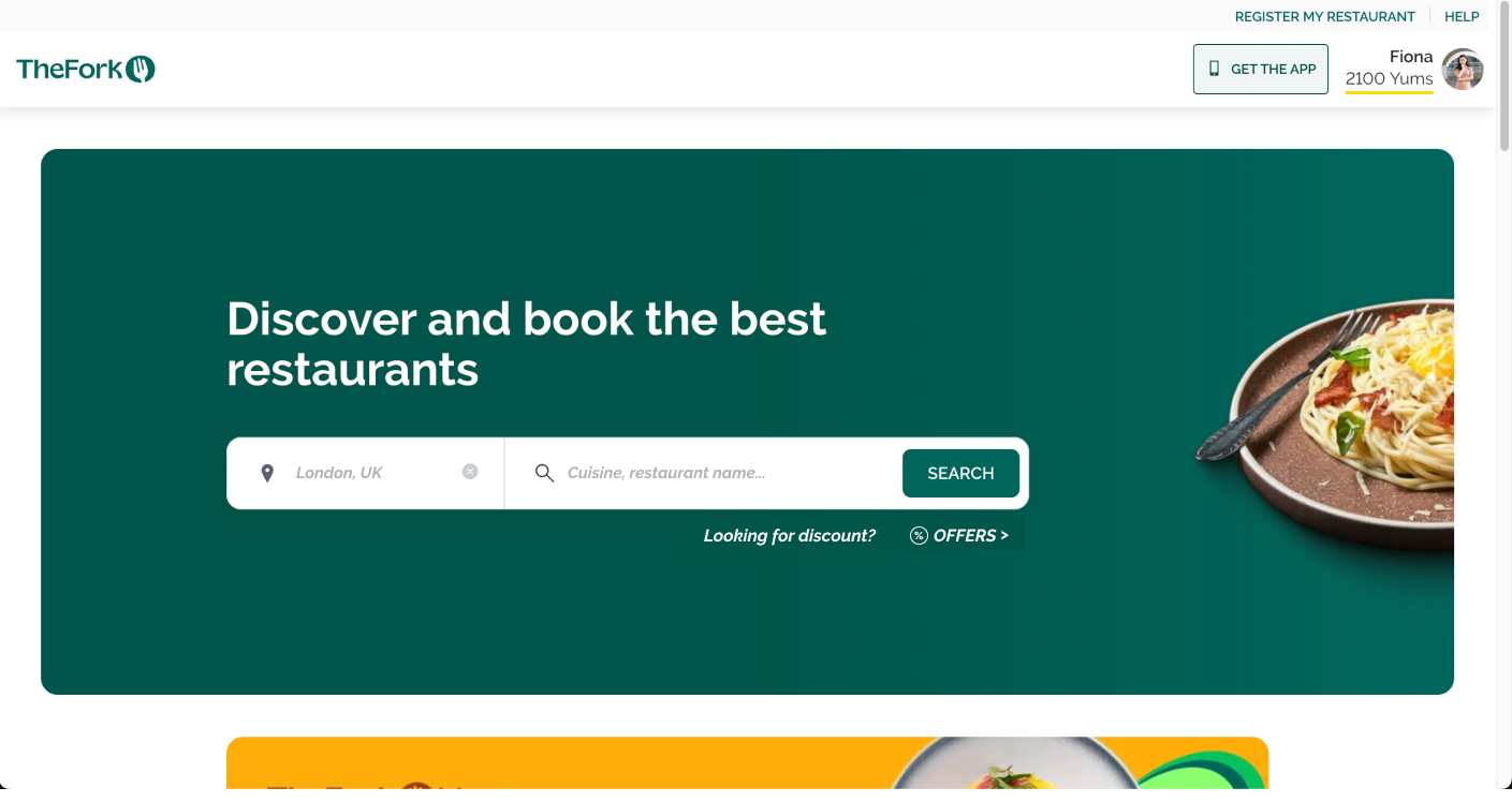
- As a foodie, I love exploring new cuisines and flavours all over London. I appreciate the discount and
ranking system in "The Fork," which sparks new ideas and brainstorming.
- However, I identified several problems in the search interface, leading to frustrating results. I saw
potential in focusing on a specific part of The Fork for a project task.
My Role
Improving the user experience in the search function, specifically enhancing the search functionality, just
like a ticket in Jira.
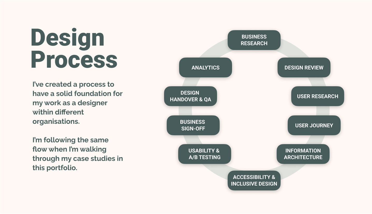
My Design Process
Business Problems & Business Goals
Business Problems
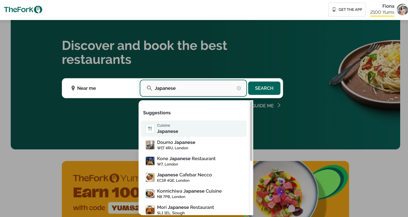
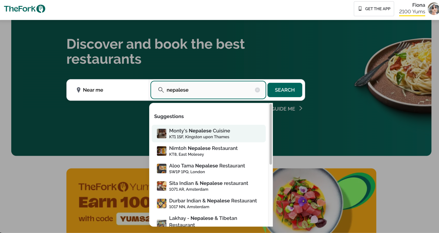
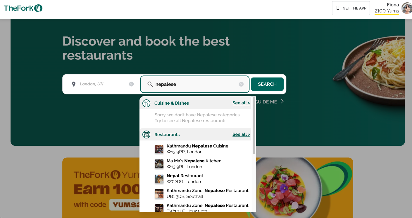
- Current search interface mix-up of cuisine & dishes/ restaurant/ offer in the drop-down, which confused
the user.
Business Goals
- Aiming to facilitate user input value, reflect the most matches from the backend to the interface,
whether that is tags, categories, or keywords match.
- Providing options for the user to personalizing their result page under lean UX principle.
Competitor Research

<---The simplest
- +ve: The simplest single search bar provides an intuitive experience, guiding users forward.
- -ve: Information filtering may not meet expectations, potentially causing dropouts in the next step.
The hardest--->
- +ve: Capable of refining the result under the user's decisions.
- -ve: Too complex on the first page with a lack of willingness to proceed.
Therefore, I need to strive for a balance between simplifying input and gaining enough information. I will
consider the options for more than one "Next step" selection, so the user can actively and easily refine the
result.
Design Review
I've reviewed the current website to evaluate what works and what doesn't - assumptions from my
professional point of view. These hypotheses will be the basis of the upcoming usability testing.
What Work [Y]
- [Y1] - Facilitate search, category browsing & inspirations in the simple search interface.
- [Y2] - Integrate category search inside the text search (e.g., Japanese).
- [Y3] - The search bar is big and intuitive, providing simple navigation.
- [Y4] - Excellent copywriting, fully describing the website's function in the top banner.
- [Y5] - Multiple categories provide substantial support for users to explore.
What Could Be Improved [N]
- [N1] - Mix-up of cuisine & dishes/ restaurant/ offer in the drop-down confused the user.
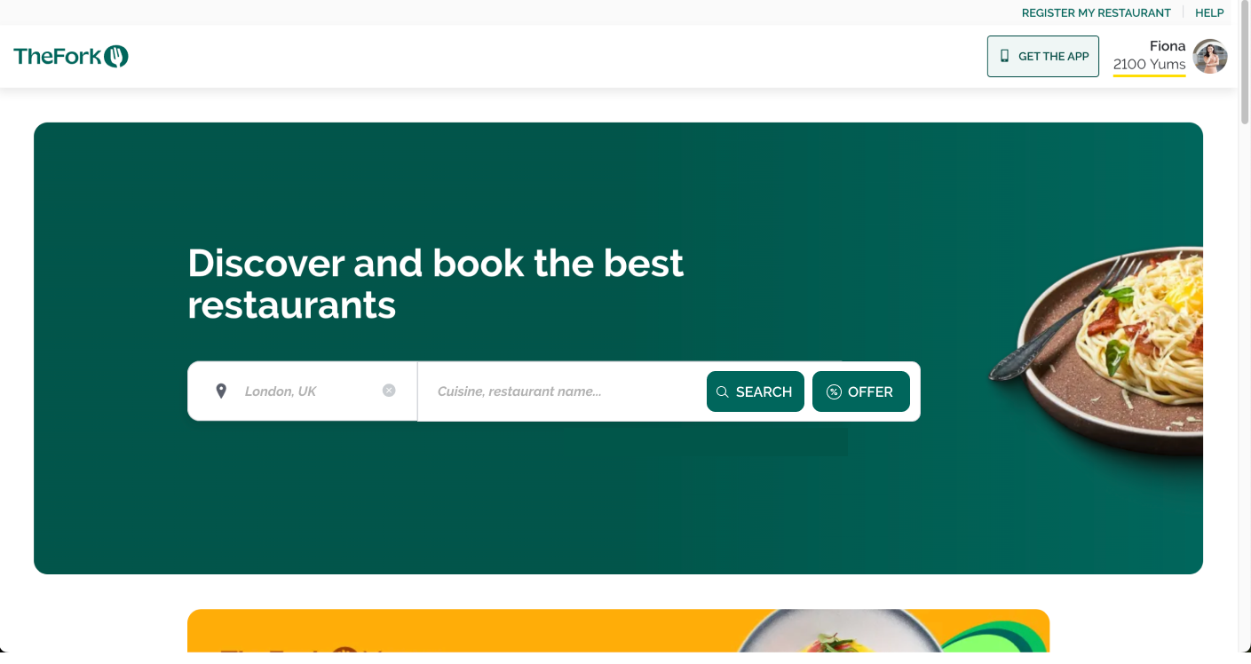
- [N2] - Offers are not intuitive within the "Cuisine, Restaurant" search.
- [N3] - Loads of icons, all the same, serving no distinct purpose.
- [N4] - Subtle scrolling may be challenging to notice.
- [N5] - Users might not be aware it covers other EU countries, preset to London.
- [N6] - Missing error message if the cuisine/ restaurant not be found (Added after the 2nd usability
testing)
- [N7] NEW - Pressing enter straight into the first restaurant confuses users, users do expect the
listing page (Added after the 2nd usability testing)
User Research
User interviews
- I have arranged 5 calls via Zoom with different levels of users to understand whether the Fork serves its
function or not.
Users Profile
- All living in the UK
- Aged 25 - 35
- All of them didn't use The Fork before
Solutions
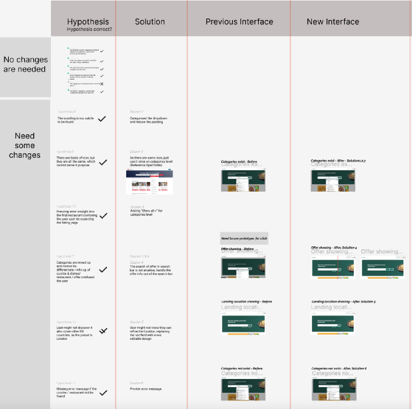
As this study only focuses on the search bar function, the hierarchy is quite simple.
This image shows my flows:
- Cross-checking if my hypothesis is correct or not by the answers of the testers in the usability test.
- Differentiating if changes are needed or not.
- Coming up with some solutions for those which need changes.
- Creating new interfaces.
- Conducting the usability test in Useberry.
Proposal 1 - Changing the Way to Handle Cuisine Category
| # |
Hypothesis |
Solutions |
| 1 |
The scrolling is too subtle to be found |
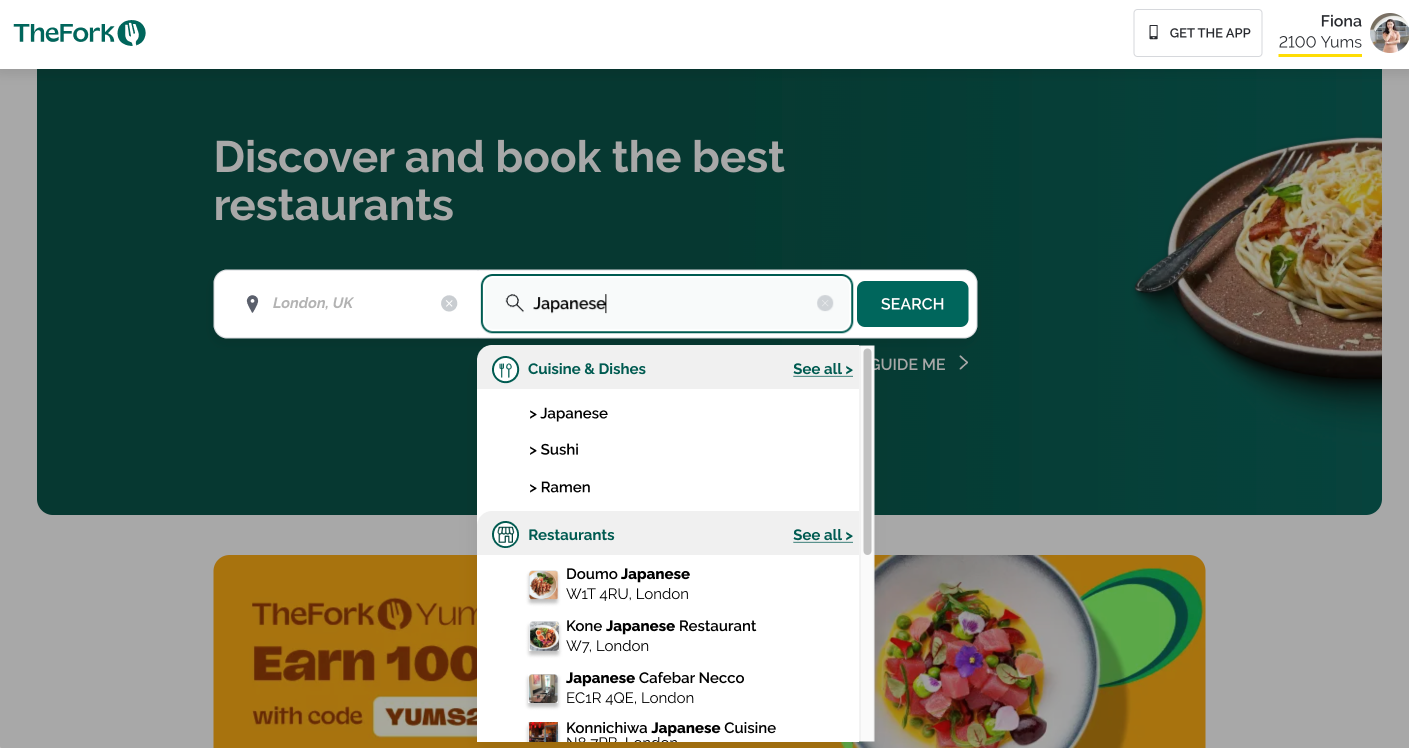
Categorised the dropdown and reduce the padding |
| 2 |
There are loads of icons, but they are all the same, which cannot serve their purpose |
As some of them are the same icon, just use it once on the categories level (Reference OpenTable) |
| 3 |
Pressing enter straight into the first restaurant confuses the user, users do expect the listing page
|
Adding “Show all >” for the categories level |
Before

After

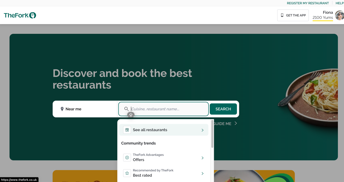
Proposal 2 - Taking out the offer from the dropdown
| # |
Hypothesis |
Solutions |
| 1 |
Mix-up of cuisine & dishes/restaurant/offer confused the users |
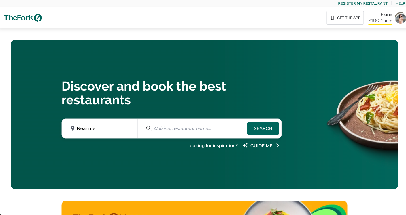
The search for offer in the search bar is not intuitive, handling the offer info out of the search bar
|
Before

After

Proposal 3 - Changing the way of indicating location
| # |
Hypothesis |
Solutions |
| 1 |
Users might not discover it also covers other EU countries, as the preset is London |
40% of users don't know they can refine the location, replacing the text field with a more editable design |
Before

After

Proposal 4 - Changing the way of showing missing categories
| # |
Hypothesis |
Solutions |
| 1 |
Missing error message if the cuisine/restaurant not be found |
Providing error message |
Before

After

Business Goals Review
-
Aiming to facilitate user input value, reflect the most matches from the backend to the interface, whether that is tags, categories, or keywords match.
- Introducing proposals 1 (normal case) & 4 (error handling), categorized the results into categories to get more organised search results. Both get 75% of support in the preference test.
-
Providing options for the user to personalizing their result page under lean UX principle.
- For the location, I was trying to make the location bar look more editable in proposal 3. However, I just got 57% success in the preference test. I might need to find more ways to optimize the result.
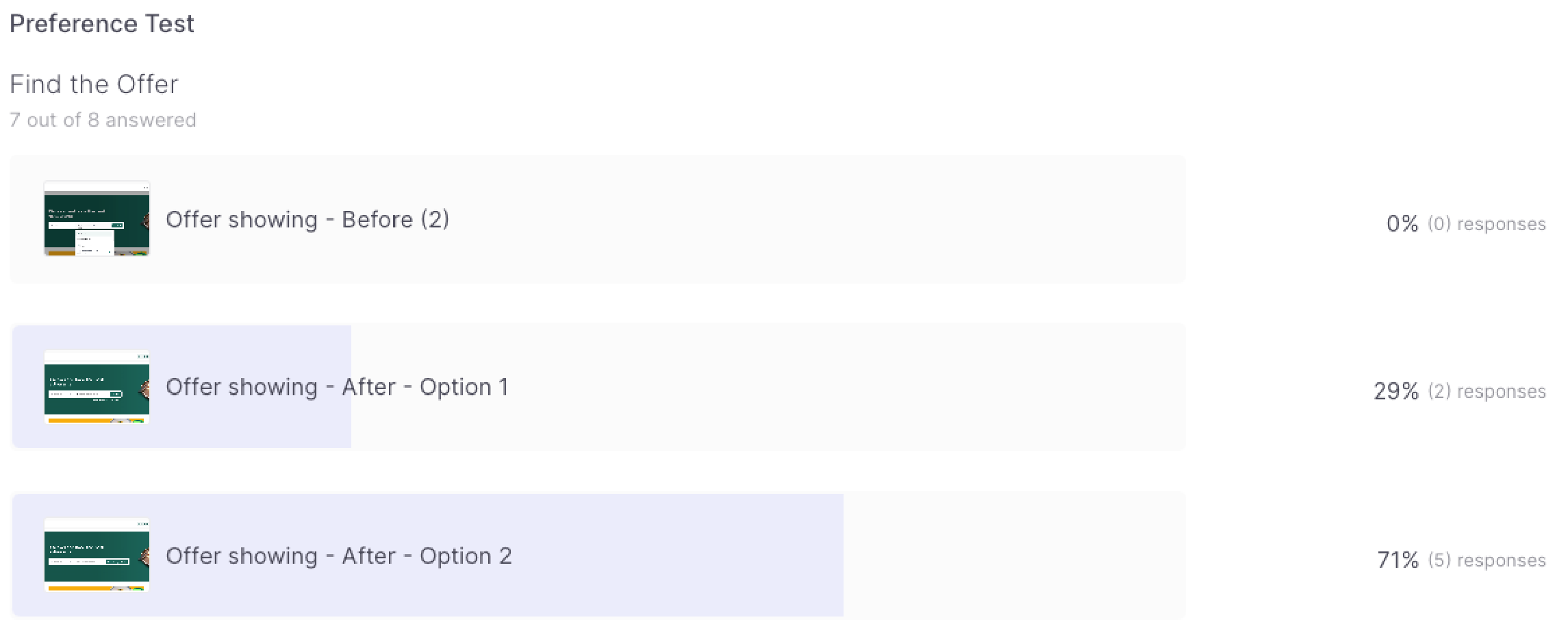
- For the offers, I did two offers showing layouts in proposal 2, both separating the offers from the main search bar and the one which I have shown in the after screen gained 71% in the preference test. It will help the user to construct a highly customized search result page.
Project Review
Limitation on Prototype
It's hard to mimic the searching behaviours of the users. Every user might have a habit of
searching, so the result might be various based on personal habits.
No. of Testers
This is one of the personal project cases of the seven-month UX Design Bootcamp. For my
preference test, I just covered it with eight testers. If my tester no. reach 20 people, it might help me
to uncover more problems and increase the trust level of my studies.

